PRODUCT CONTEXT
Orbit Wallet is a prepaid fintech solution built on the NCMC framework that makes everyday payments simpler. It allows users to tap and pay seamlessly across metros, public transport, and offline stores using a single card. The goal is to bring together these fragmented payment experiences into one easy, accessible, and intuitive system that fits naturally into daily life.
KEY IMPACTS

MY ROLE
Owned end-to-end design: user research, UX strategy, prototyping, user testing, and final experience delivery.
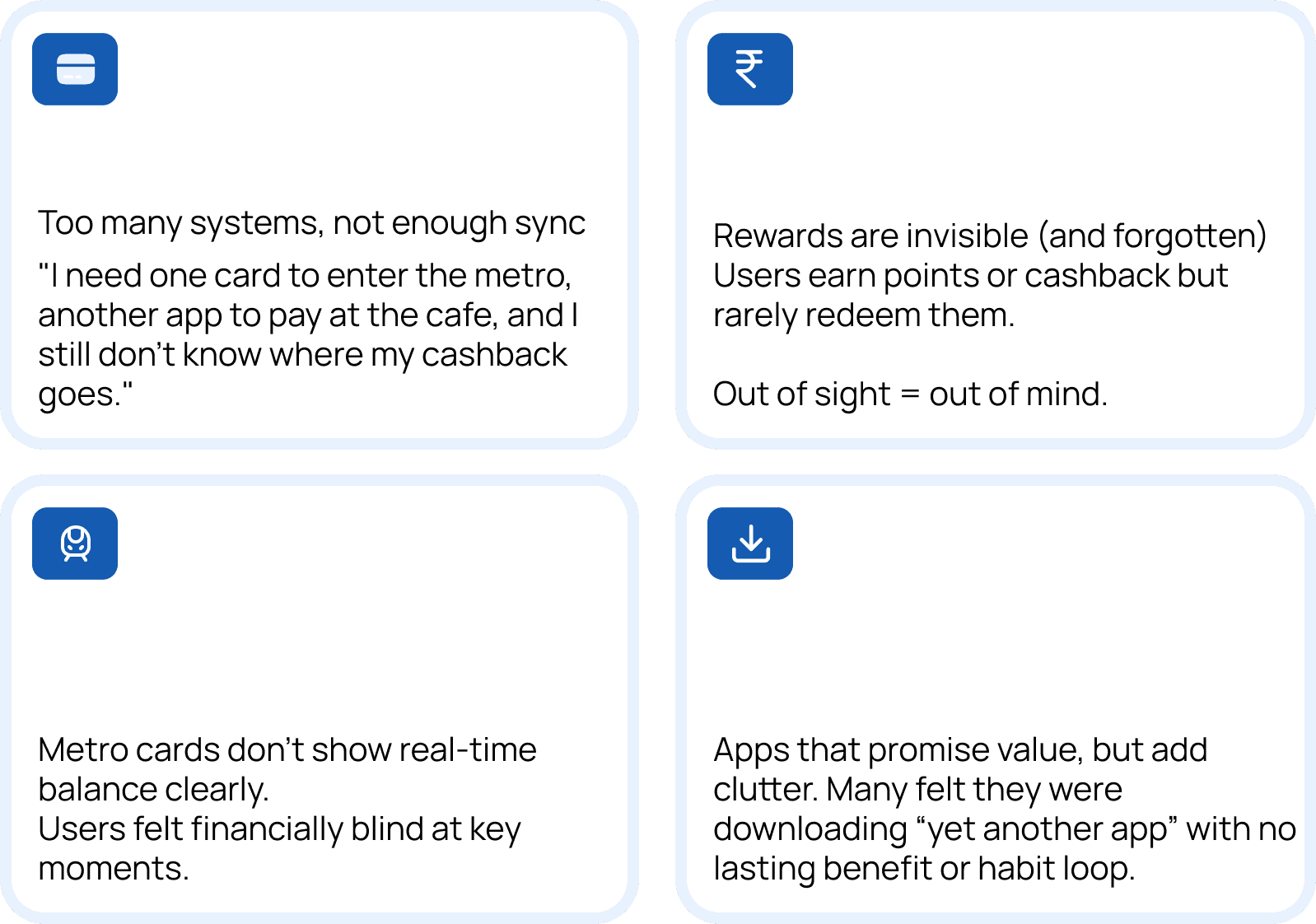
PROBLEM IDENTIFIED
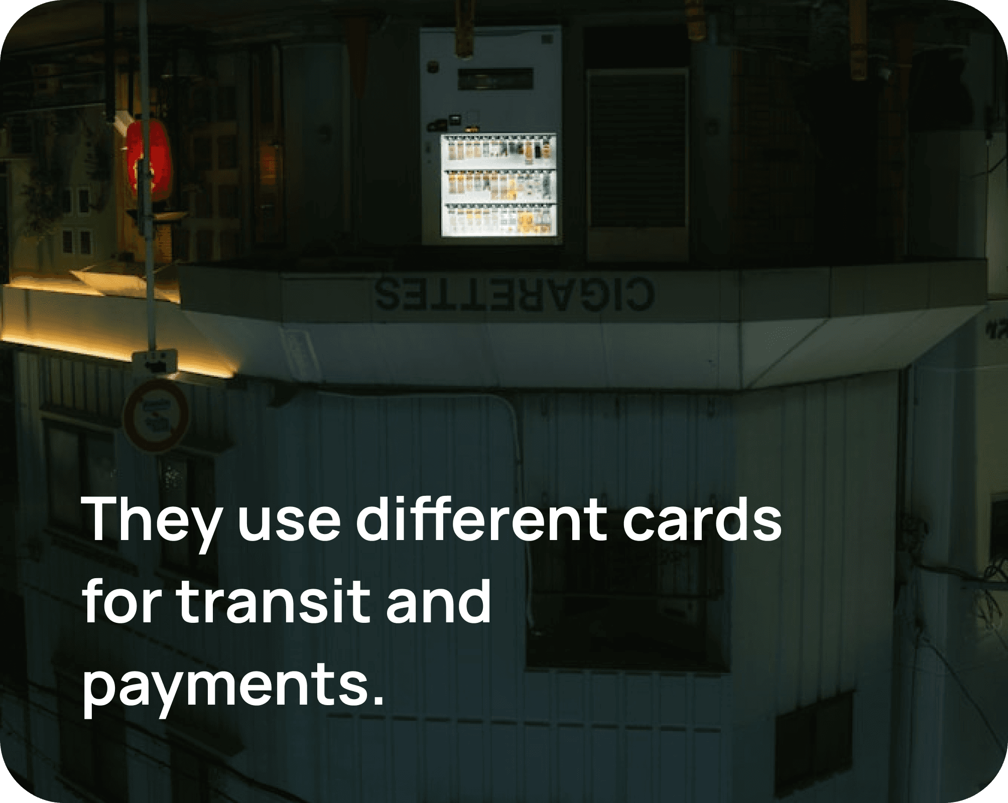


What I saw on ground

Unpacking everyday chaos in metro journeys
As this project kicked off, it became clear that the problem wasn’t just about building a wallet, it was about rethinking how people move through their day. The goal wasn’t to design just another product, but to untangle the small frictions that add up to big frustration.
To understand this better, we spoke to metro riders, small business owners, and frequent digital payment users across Bangalore.
What emerged was a surprisingly consistent narrative:
the system was designed for convenience, but delivered fragmentation.
Who we were building for

We were designing for people on the move,
each with a different rhythm, but the same everyday needs.
To understand them better, we mapped out and spoke with:
PERSONA IDENTIFICATION

The Daily Commuter
Office-goers who use the metro every weekday
Needs: Speed, reliability, rewards that make sense
Pain: Juggling multiple apps before/after transit

The Student on a Budget
College students taking metro + eating out frequently
Needs: Budget friendly, one app for multiple use cases
Pain: Unclear balances, reward systems that felt gimmicky

The Tech-Cautious User
Senior citizens and non-tech-savvy passengers
Needs: Simplicity, offline access, clear feedback
Pain: Confusing app flows and lack of support in low-signal areas

Where I Stepped In
My role wasn’t to invent Orbit.
It was to reimagine its ecosystem
to build the companion app
shape the digital identity
help the card find its purpose in real people’s pockets.
TIME TO ASK REAL QUESTIONS

What Could Orbit Be?
Rethinking the Card for
Recall & Recognition
The Orbit Card needed a stronger presence, something bold enough to stand out on a crowded metro platform, and simple enough to feel familiar.
I explored multiple color systems, gradients, and brand marks that balanced playfulness and trust.


THIS IS HOW IT STARTED
Let’s skip the obvious. By now we know how onboarding works for fintech


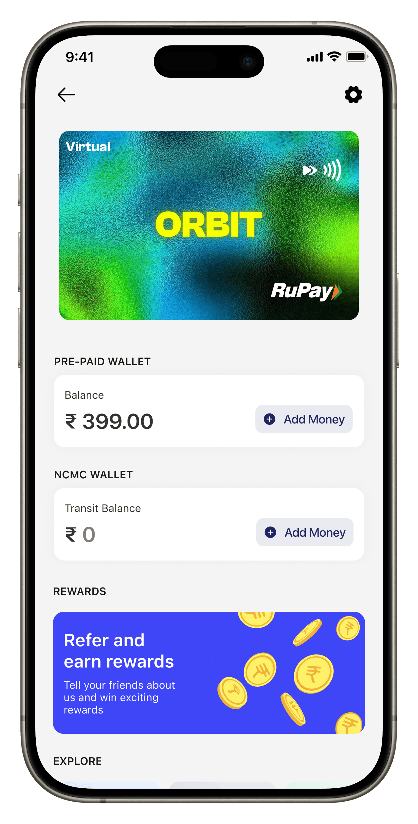
From Card Activation to Ecosystem Engagement

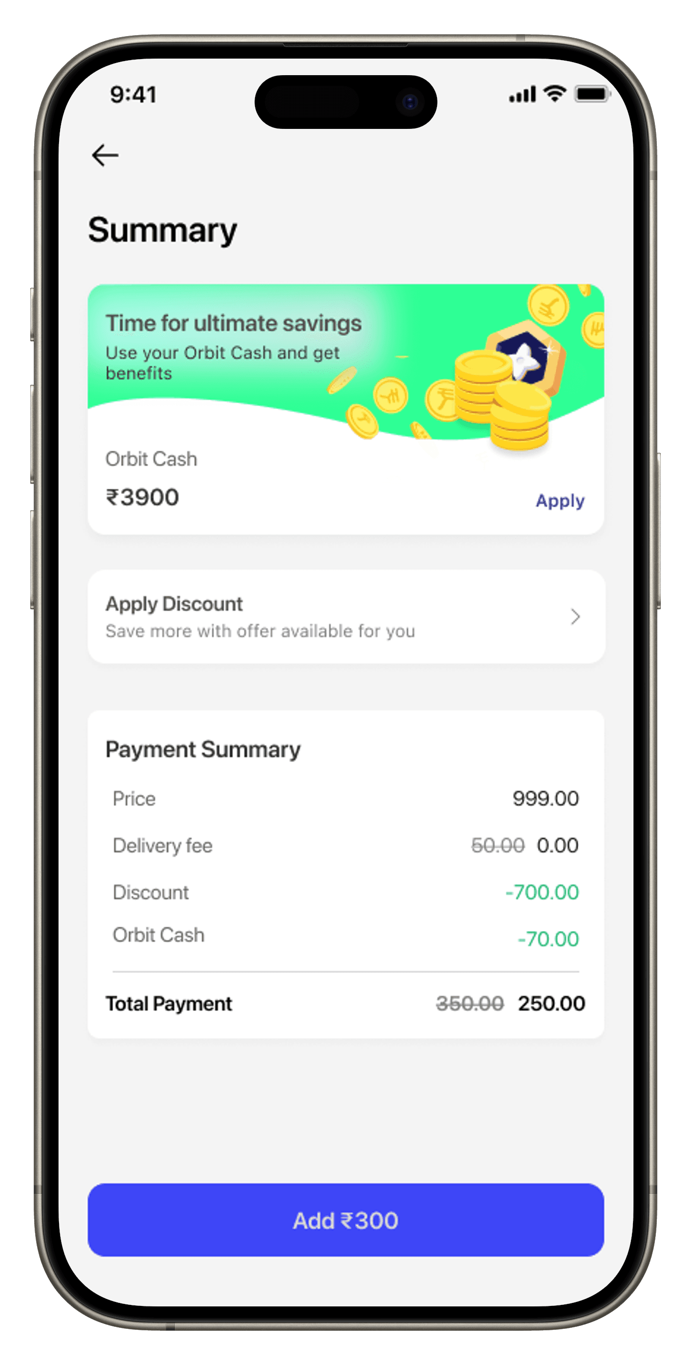
user wants to ADD BALANCE IN virtual orbit card


Old UI
New UI
Cluttered layout with too many elements
9:41
Intermediary Balance
₹120.00
Card Balance
₹399.00
Transit Balance
₹100.00
Harshvardhan Zaveri
XX 1234
Add Card Balance
Add Transit Balance
Rewards
Refer and earn rewards
Tell your friends about us and win exciting rewards
Explore
Unlock great deals on food
Exclusive offers on lifestyle brands
Mobile recharge in few seconds
Your Recent Transactions
View all
M
LQORBIT
24 Jul, 6:20 PM
+₹100.00
Balance- ₹100.00
B
LQORBIT
24 Jul, 6:20 PM
+₹100.00
Balance- ₹100.00
B
LQORBIT
24 Jul, 6:20 PM
+₹100.00
Balance- ₹100.00
Card
Transit
9:41
PRE-PAID WALLET
Balance
₹ 399.00
Add Money
NCMC WALLET
Transit Balance
₹ 0
Add Money
REWARDS
Refer and earn rewards
Tell your friends about us and win exciting rewards
EXPLORE
Unlock great deals on food
Exclusive offers on lifestyle brands
Mobile recharge in few seconds
YOUR RECENT TRANSACTIONS
View all
M
LQORBIT
24 Jul, 6:20 PM
+₹100.00
Balance- ₹100.00
B
LQORBIT
24 Jul, 6:20 PM
+₹100.00
Balance- ₹100.00
B
LQORBIT
24 Jul, 6:20 PM
+₹100.00
Balance- ₹100.00
Card
Transit


Virtual
Balances and actions are cramped together
Low visual hierarchy everything feels equally important
Card design lacks brand presence
Bright card grabs attention and shows brand personality
Better spacing improves readability
“Add” buttons are aligned and contextual
Clear separation of prepaid and NCMC balances
Rejected
ONE CARD, MULTIPLE NEEDS
We are here to save your time and efforts

Check Balance
Tap your RuPay card at the back of your mobile and tap on check balance to know your transit balance
Update Balance
Tap your RuPay card at the back of
your mobile and tap on update
balance to update your transit balance
Create Service Area
Tap your RuPay card at the back of
your mobile and tap on create any
service area for hassle free travel.
FEEDBACK AND LEARNINGS
ALWAYS QUESTION YOUR DESIGN DECISIONS.
The founders are also learning
make mistakes and unlearn


Let’s deep dive and connect!!
nishthaadesign@gmail.com

Designing a unified tap-and-go experience for India’s everyday commuters
A FinTech experience designed to simplify metro travel, shopping, and rewards